Quote Component
A Quote component displays a block quote with styled quotation marks, quote text, author's name & description. Additionally, it allows including the author's image.
Usage
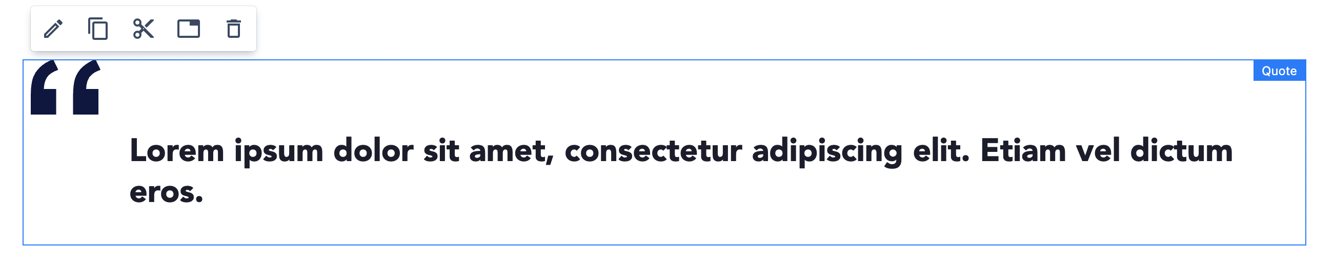
Drag & drop Quote to a Page Section. By default a simple quote with "lorem ipsum" text is visible.
Authorable properties
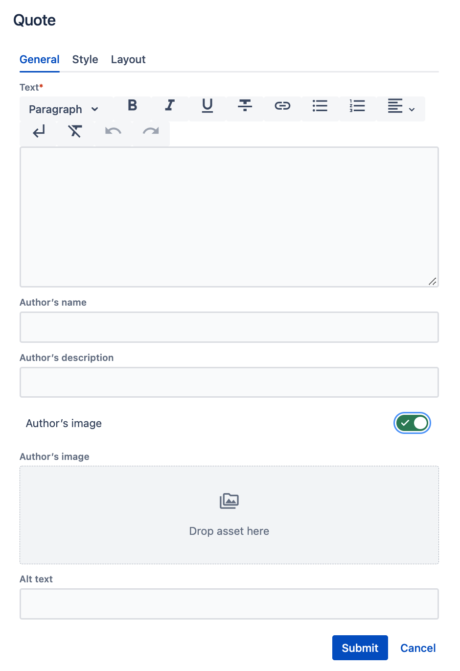
Click  ("Edit" icon) on the Quote component to see its properties
On the General tab you can add:
- Text - the main content of the quote
- Author's Name
- Author's Description
- Author's Image - if you switch on the toggle additional properties will be visible:
- Asset section - from the left assets panel you can drag&drop an image to the asset section
- Additionally, you can provide an alternative text (alt) to describe an image. Leave it blank only when the image is purely decorative.
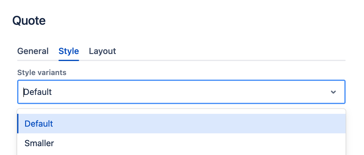
You can change the Style for the Quote using the Style tab. Smaller variant will decrease the quote's font-size.
You can also resize the Quote as any other component using the Layout tab. (See grid description for details.)
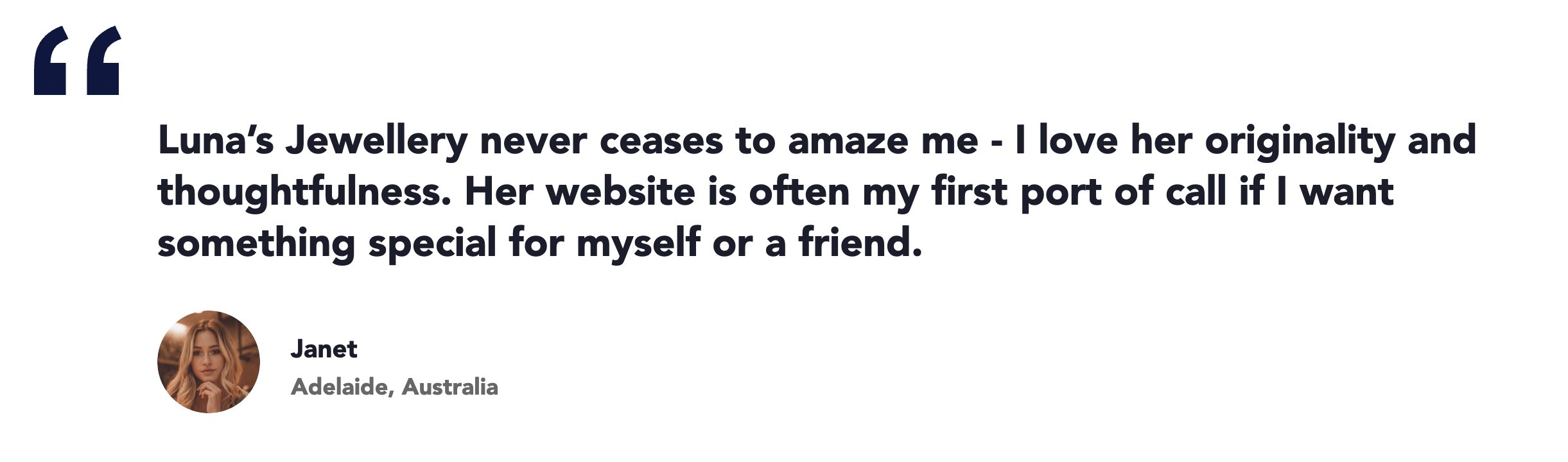
Rendered component
An example Quote: