Accordion & Accordion Item
An Accordion is an interactive component that can have multiple Accordion Items inside. Each Accordion Item is 'collapsed' by default, and only a title is visible. To open the accordion item, switch editor to the "Preview" mode and click on heading.
Usage
Drag & drop Accordion to a Page Section. Accordion will be prefilled with 3 initial Accordion Items.
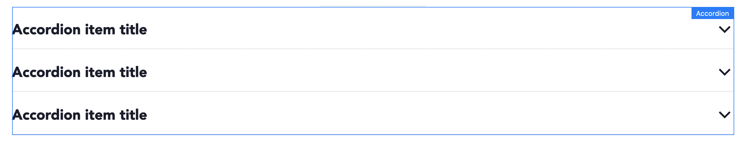
You can drag & drop additional Accordion Item to Accordion component, or delete unneeded items. You can also move Accordion Items up/down to achieve expected items order.

Authorable properties
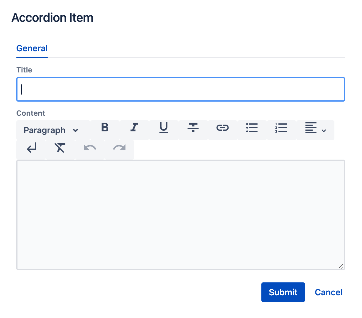
Click  ("Edit" icon) on Accordion's Item to see its properties:
- Title - the Accordion's heading.
- Content - text to be displayed inside the Accordion Item.
Click ("Edit" icon) on the Accordion component to resize the Accordion as any other component using the Layout tab. (See grid description for details.)
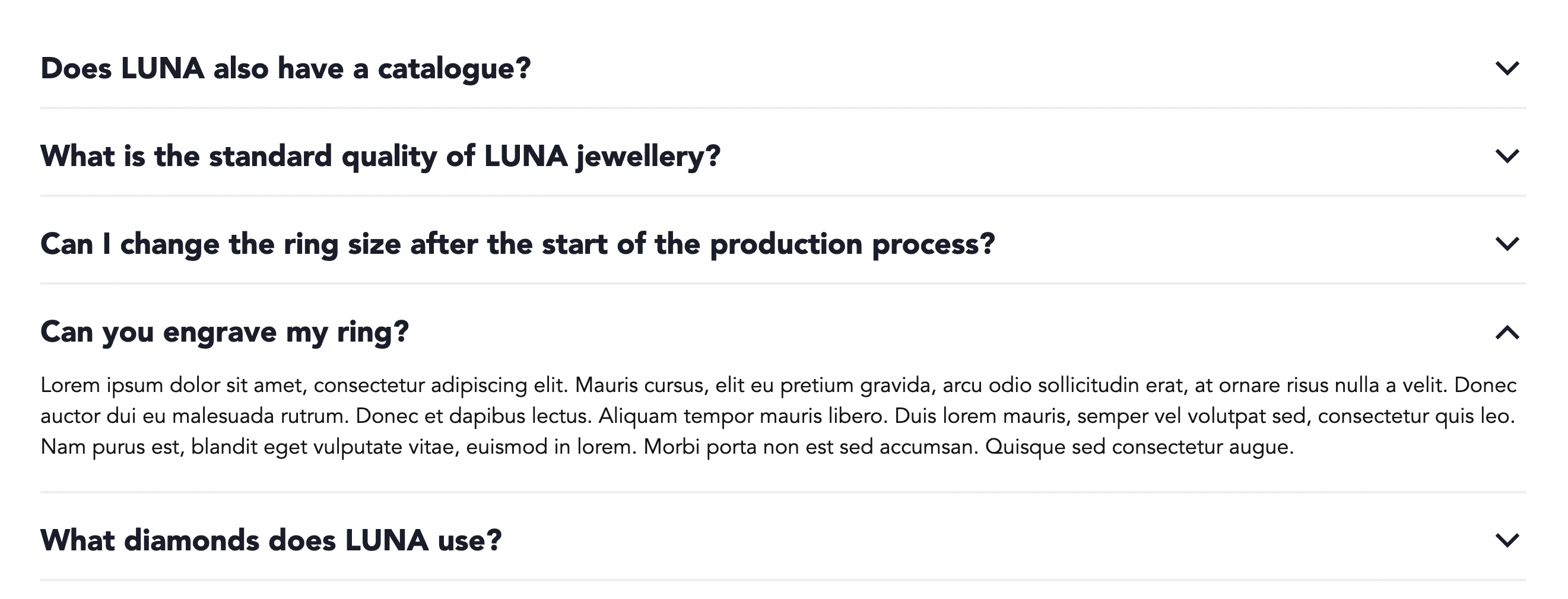
Rendered component
An example of FAQ Accordion with one item open (in preview mode):