Dialogs
The Dialogs framework in WebSight CMS allows users to define dialog field components. They can use these components to build dialogs for submitting data that is saved in content resources.
WebSight CMS delivers a set of ready-to-use components. These are detailed in the subsections of this documentation page.
Rendering dialogs
In this documentation, we present dialogs configurations in a modal, which is the default dialog rendering. However, dialogs can be rendered in other ways, for example as a side panel.
Dialog structure
Each dialog can be built using two element types:
- containers - used to achieve proper structure of fields in a dialog. Examples: container, tab, tabs
- fields - used to input values via dialogs. Examples: textfield, numberfield, pathPicker
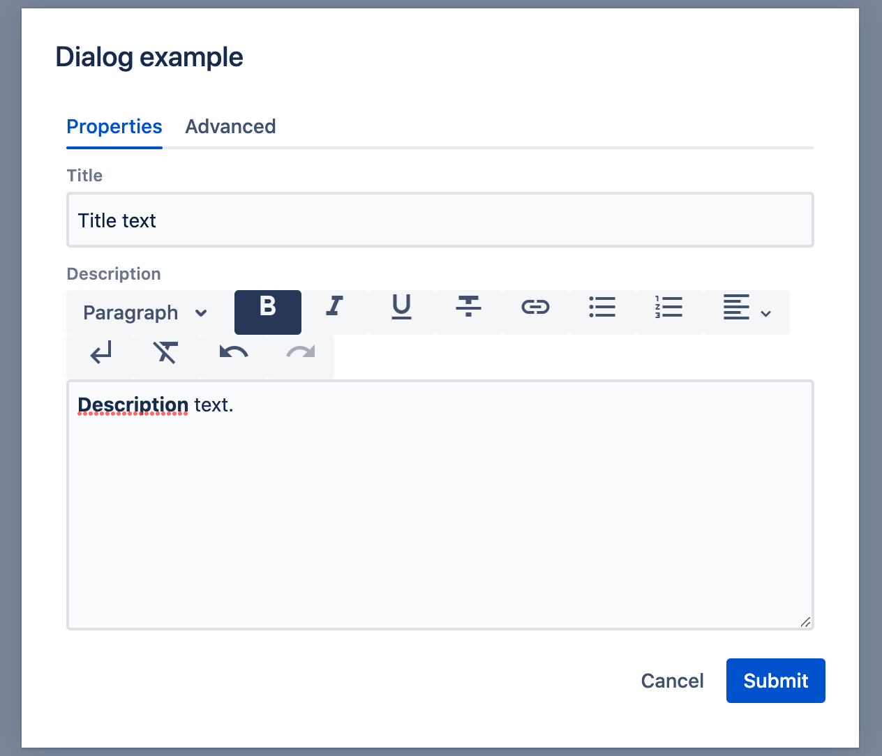
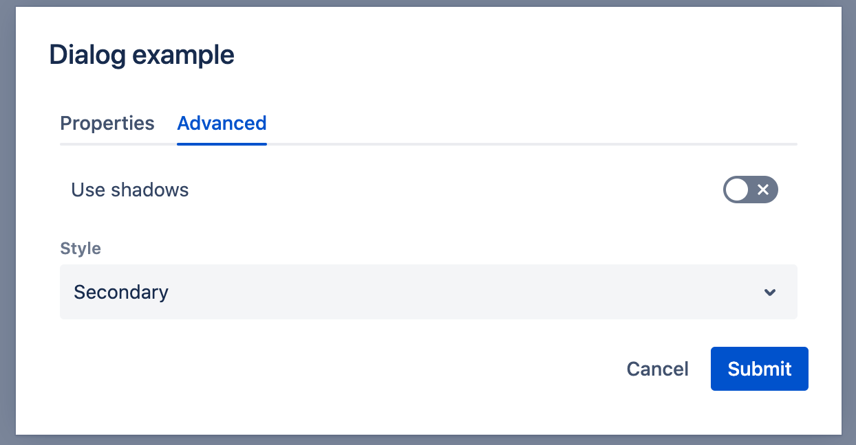
An example dialog structure definition:
{
  "sling:resourceType": "wcm/dialogs/dialog",
  "tabs": {
    "sling:resourceType": "wcm/dialogs/components/tabs",
    "properties": {
      "sling:resourceType": "wcm/dialogs/components/tab",
      "label": "Properties",
      "title": {
        "sling:resourceType": "wcm/dialogs/components/textfield",
        "label": "Title",
        "name": "title"
      },
      "description": {
        "sling:resourceType": "wcm/dialogs/components/richtext",
        "label": "Description",
        "name": "description"
      }
    },
    "advanced": {
      "sling:resourceType": "wcm/dialogs/components/tab",
      "label": "Advanced",
      "shadows": {
        "sling:resourceType": "wcm/dialogs/components/toggle",
        "name": "shadows",
        "label": "Use shadows"
      },
      "style": {
        "sling:resourceType": "wcm/dialogs/components/select",
        "label": "Style",
        "name": "style",
        "primary": {
          "sling:resourceType": "wcm/dialogs/components/select/selectitem",
          "label": "Primary",
          "value": "primary"
        },
        "secondary": {
          "sling:resourceType": "wcm/dialogs/components/select/selectitem",
          "label": "Secondary",
          "selected": true,
          "value": "secondary"
        },
        "link": {
          "sling:resourceType": "wcm/dialogs/components/select/selectitem",
          "label": "Link",
          "value": "link"
        }
      }
    }
  }
}
This will result in the following within the UI dialog:
Data structure
The data structure depends on the name property.
-
In a simple example, a property value is saved directly as a resource property.
In the above example, the"title": { "sling:resourceType": "wcm/dialogs/components/textfield", "label": "Title", "name": "title" }titleis added directly as a resource property.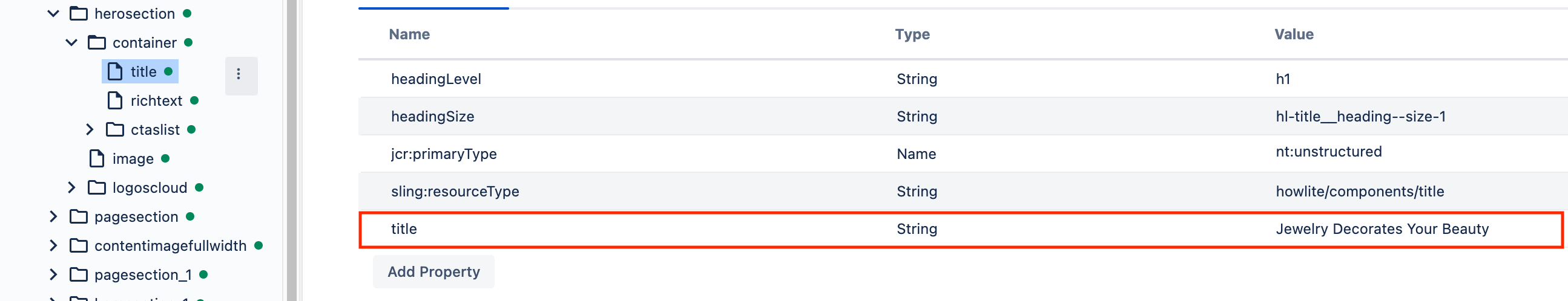
-
You can also manipulate data from other resources by using a path in the
nameproperty:In the above example, the"alt": { "sling:resourceType": "wcm/dialogs/components/textfield", "name": "image/alt", "label": "Alt text" }altproperty is saved as an image property from the header context.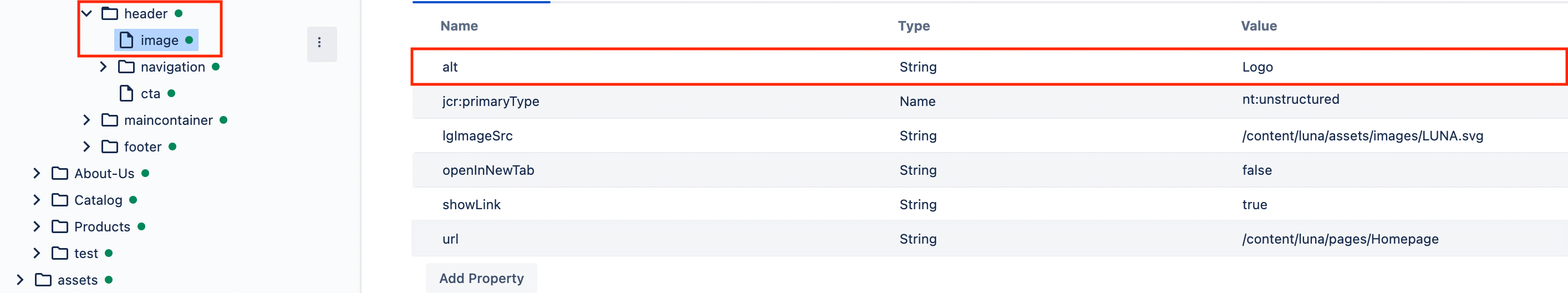
-
You can also manipulate data from other resources using a multifield. The following dialog field
nameproperty defines a node, under which we create other resources with properties defined in the multifield property."urls": { "sling:resourceType": "wcm/dialogs/components/multifield", "name": "urls", "label": "Footer URLs", "labelField": { "sling:resourceType": "wcm/dialogs/components/textfield", "name": "label", "label": "Label" }, "addressField": { "sling:resourceType": "wcm/dialogs/components/pathpicker", "name": "address", "label": "URL" } }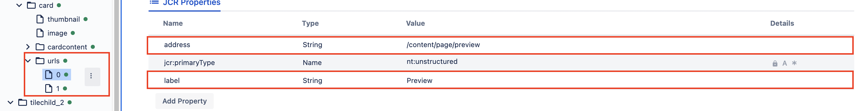
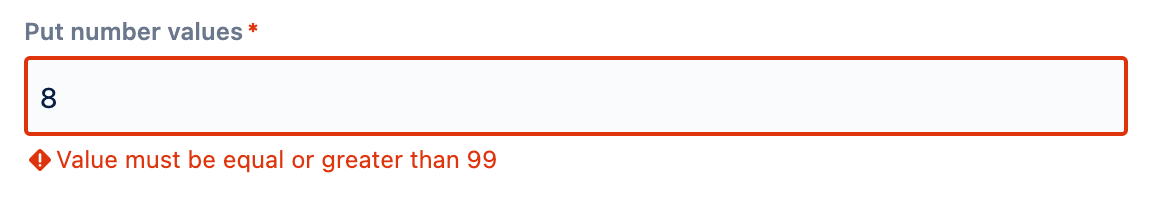
Validation
WebSight supports the validation of dialog values on the backend side. If the value is incorrect, it won't be saved and the dialog can't be submitted. The author will see an error message:
Custom validator
To prepare a custom validator you have to extend pl.ds.websight.dialog.spi.DialogValidator from pl.ds.websight:websight-dialogs-service as an OSGi @Component(service = DialogValidator.class).
You must implement the following methods:
boolean supports(Resource resource)- should return whether the dialog resource is supported by this validator. This check will be done for each resource that represents dialog fieldsString validate(Resource resource, Map<String, Object> propertiesToSave)- should return a validation result as follows:success- return nullerror- return String with an error message, which will be displayed in the dialog
Show/hide dialog fields
By default, all dialog components are visible, but you can hide them if you wish.
Context
To show or hide a particular field depending on dialog context you can use the ws:disallowedContext parameter.
The default context value used for dialogs is edit. Depending on dialog usage, different contexts might be used. For example, when creating a page, the 'create' context is used. This way some fields might be disabled during the page creation process.
To hide an element in dialog, the request from the front-end that fetches it must contain the additional parameter context. If the context value matches one of the ws:dissallowedContext values, then the field won't be rendered. To check request details, refer to the Swagger documentation.
In some cases, context values are more specific. These can contain both the action name and the place of usage separated by :, for example edit:dialog or edit:panel. It is possible to disable fields by action name. In this case, every context that matches the action will be disabled. For example, to disable both edit:dialog and edit:panel there is no need to disable them one by one. It can be simplified to:
Conditions
To show or hide a particular field based on other fields' state, you can use a ws:display node.
This node should contain children that define the conditions that determine whether the element is displayed. If the component has this child node, it's hidden by default. It must fulfill at least one of the defined conditions to show the component.
Each condition should have two properties:
- sourceName - the name of the component whose value would be checked
- values - one or more values. At least one of them should match the source field value to fulfill the condition.
Example conditions configurations:
- with single value:
- with multiple values:
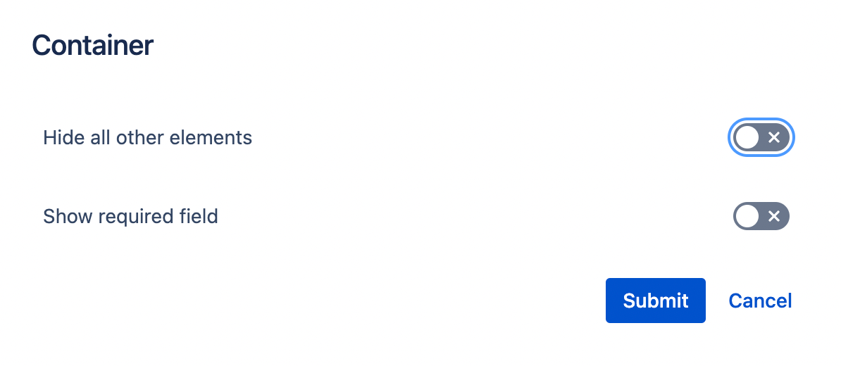
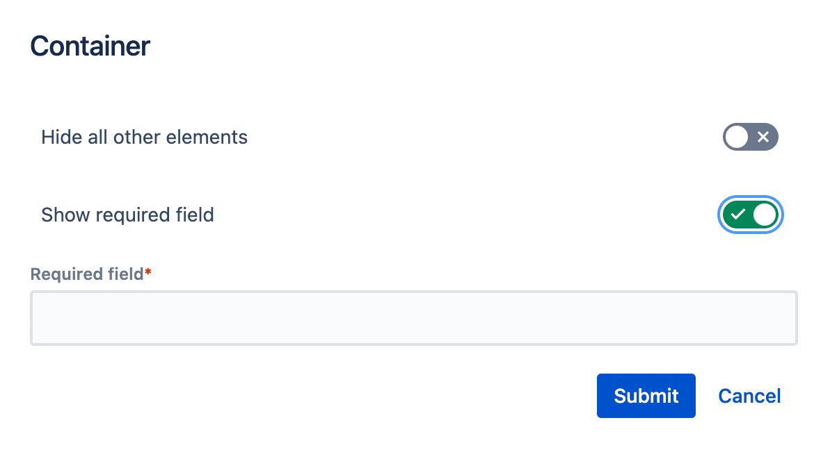
Example dialog definition:
{
  "sling:resourceType": "wcm/dialogs/dialog",
  "hideall": {
    "sling:resourceType": "wcm/dialogs/components/toggle",
    "name": "hideall",
    "label": "Hide all other elements"
  },
  "container": {
    "sling:resourceType": "wcm/dialogs/components/container",
    "showrequiredfield": {
      "sling:resourceType": "wcm/dialogs/components/toggle",
      "name": "showrequiredfield",
      "label": "Show required field"
    },
    "requiredfield": {
      "sling:resourceType": "wcm/dialogs/components/textfield",
      "name": "requiredfield",
      "label": "Required field",
      "required": true,
      "ws:display": {
        "condition": {
          "sourceName": "showrequiredfield",
          "values": "true"
        }
      }
    },
    "ws:display": {
      "condition": {
        "sourceName": "hideall",
        "values": "false"
      }
    }
  }
}
To correctly handle all display conditions the component should also have initial field values set.
template/content.json file for this example.
-
Initial dialog state:
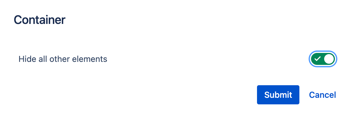
-
Checking "Hide all other elements" hides the second field.
-
Checking "Show required field" shows another field.
Default state
It's important to keep what that author sees consistent with state stored on backend. All visibility conditions on dialog are checked both on backend and frontend. Use the Component template to initialize the values when component is fist added on a page. To add default values on new fields on existing components you can:
-
Change the content manually (when is managed in git repository)
-
Use Groovy Console to prepare script migrating the existing content
-
You can also use @Default annotation on Model field. But be aware that it's only setting this value in the context of model class. The values on dialogs and visibility conditions are not affected by this.