Components
Overview
This document describes the components concept. It also shows how to use components in the WebSight CMS authoring interface.
In this documentation we use the follow terms:
- WebSight CMS pages editor: Refers to the UI for authoring page content
- WebSight Resource Browse: Refers to the administration tool that allows users to see the resources (data and application) that are available on the WebSight CMS instance
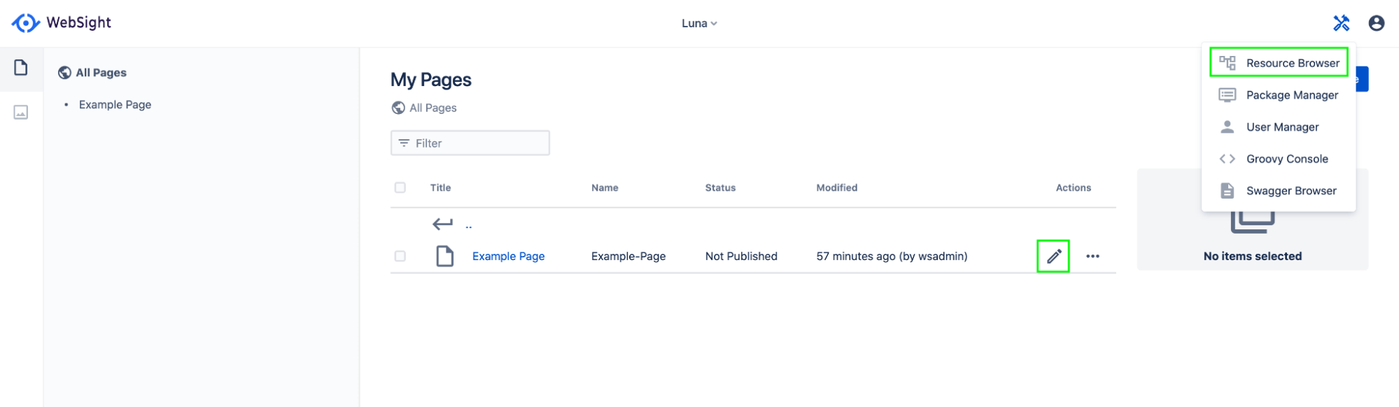
Both views can be opened from the WebSight UI:
Check the WebSight project setup documentation to see more details about:
- what WebSight CMS is, and what it gives you
- implementing applications for WebSight CMS Community Edition
- the role of OSGi, OSGi bundles, Sling Resources, JCR and more in WebSight CMS
What is component
Components are:
- elements that render parts of content according to implemented functionality
- used to assemble content (like pages)
- available in the WebSight CMS authoring interface
- reusable
- configurable by editing properties on created components instances
- implemented by developers
- shipped in OSGi bundles that are deployed to a WebSight CMS instance
Components can:
- include (embed) other components
- extend other components
- deliver initial content
- define dialogs, which are used to edit properties on component instances
- be containers (allowing you to add child components during authoring)
- define allowed child components (in the case of containers)
Using components
To provide more context on components, let's look at the authoring interface and content data structure.
The WebSight CMS page editor lists all available components that can be used to build pages on a given WebSight instance. Available components depend on the OSGi bundles that delivering components installed on the instance. Those components can be added to the page by dragging them to the page content view at the center of the screen.
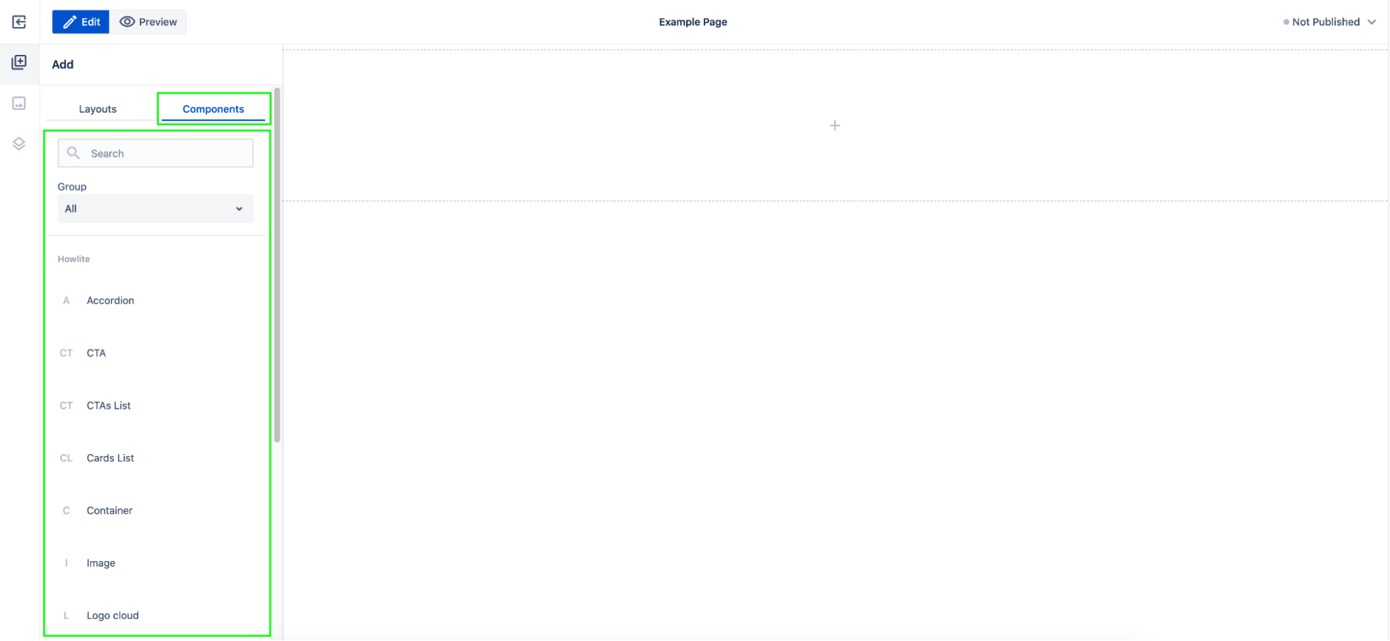 Components definitions listed in the WebSight CMS page editor.
You can check the page content structure in the page editor content tree tab. This view presents the components tree under page content. This example page contains just the Page Section component, which is the only component present currently in the page content of this example page.
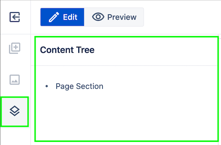
Page content tree in the editor.
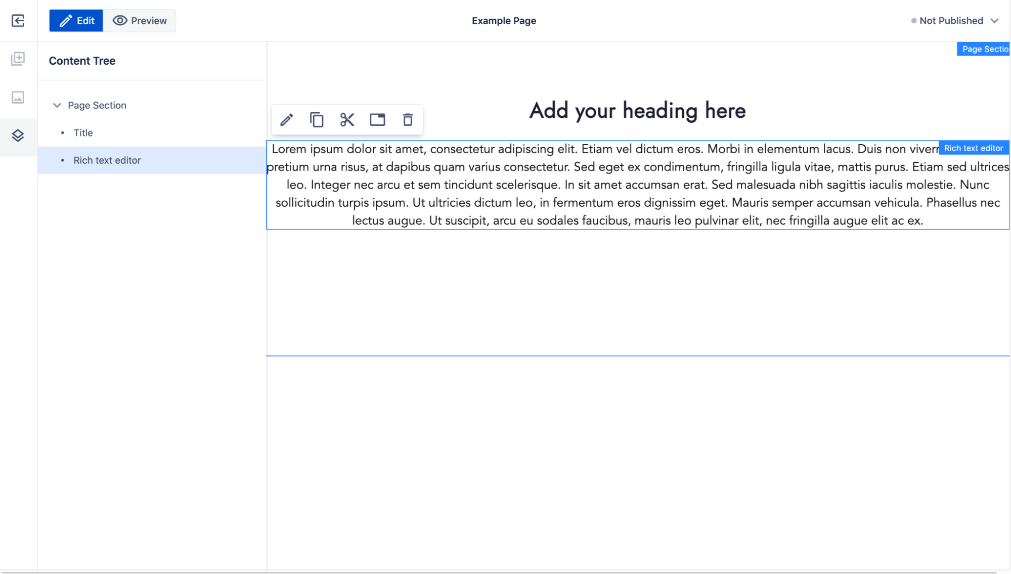
The Page Section component is a container. It allows you to add other components via the authoring interface. The page editor content section displays an empty Page Section component as a box containing the placeholder text "Drag components here."
After dragging and dropping the Title and Rich Text components, the page content tree is updated with new nodes. The nodes visible in the content tree are the instances of components.
Title and Rich Text components are not containers, so other components cannot be added as their child components. While dragging other components from the components list, the new items can be added next to those components as other children on the Page Section component.
After adding a component to the page, the edit action can be used to edit the selected component instance. The dialog that is displayed is a part of the component definition. It is defined by the developer implementing a given component by setting the proper dialog fields (see more in the Dialogs documentation). Properties set via the dialog are saved at edited component instances, and are used by the component to render the appropriate part of content based on the implemented functionality. For example, the Title component renders the Heading text field value in the HTML <h> tag and allows you to set <h> tag level and styling.
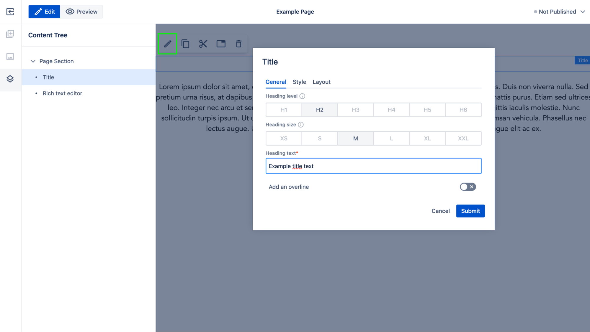 Components are reusable. Another Title component can be added to the page and configured with its own data.
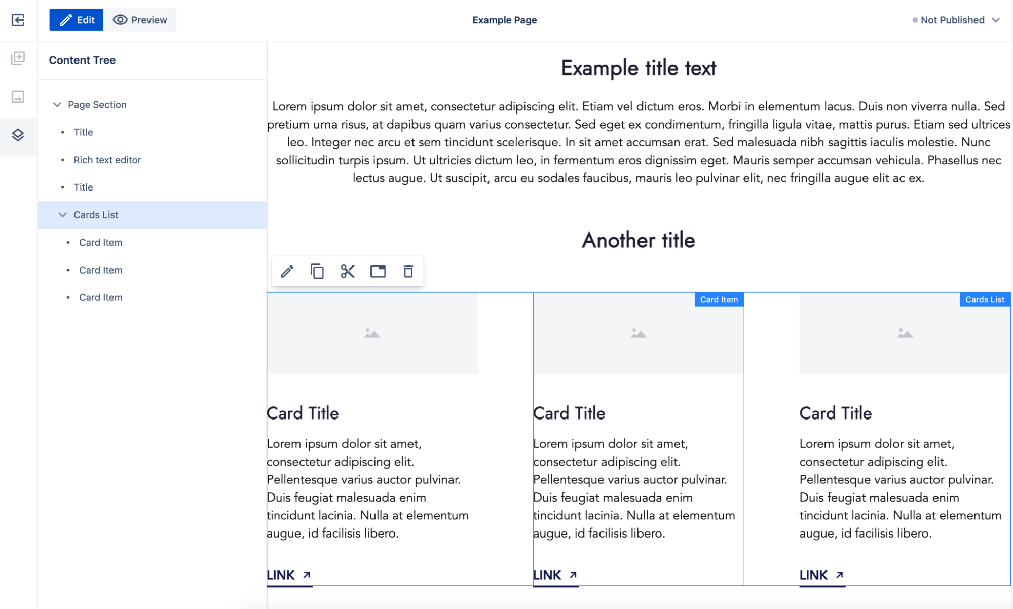
After the second title, the Cards List component is added now. This component is a container but implemented to work with specific type of child components: Only Card Item components can be added inside (this behavior is part of the Cards List component definition).
The Cards List component defines initial content that is added to the page when adding a component. The initial content contains 3 child Card Item components (to save work during authoring and present the component in an initialized state).
In the content tree, you can see that the Card Item components are child components of the Cards List component.
You can continue with assembling and configuring page content based on the available components.
Component definition
Components are implemented by developers and delivered as resources following a defined structure. The resources should be provided in the OSGi bundle. See the project setup documentation for more details.
In this section we will see how the component definition resources structure should look.
Simple component definition example
Let's see what a simple component definition looks like.
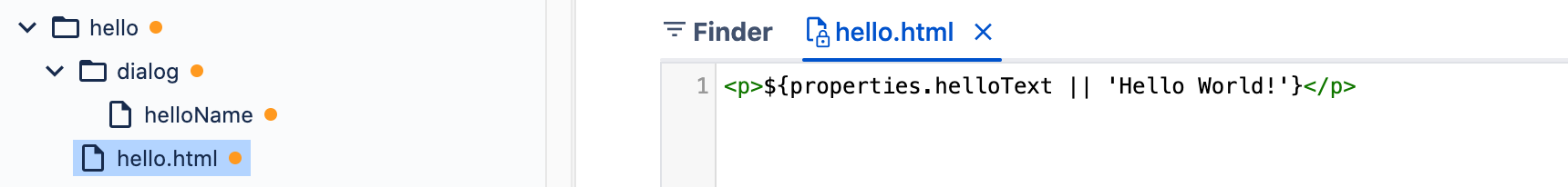
We see a component named Say Hello. It provides dialog with one text field, which can be used in the authoring interface to set the hello text rendered on the page using the <p> HTML tag. If the property is not set, Hello World! text will be used.
The example application delivers the resource /apps/example-site/components/hello, which is a component definition. It contains just three properties:
sling:resourceType=ws:Componentwhich makes this resource the component definitiontitle=Say Hellowhich is the title of the component visible in the authoring UIgroup=Example groupwhich is a group name visible in the authoring UI
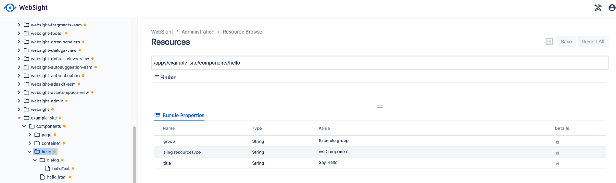 Example component definition in the WebSight Resource Browser.
The component is visible in the WebSight CMS page editor. After adding it to the page, it renders ‘Hello World!’ text.
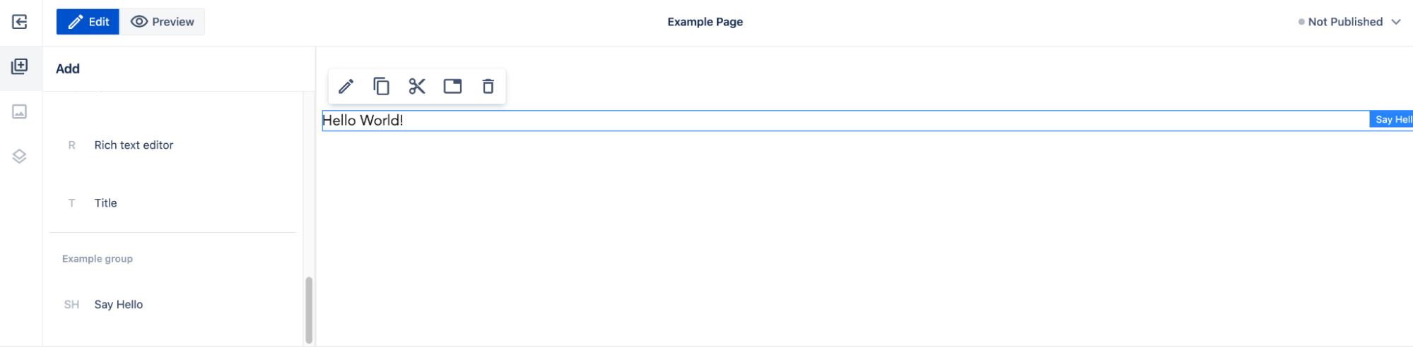
Because the Say Hello component was added to the edited page, the corresponding node was created in the page content:

The Hello World! text is rendered in the view because of the hello.html resource defined under the component definition resource that contains the script used to render the content node. The script renders the helloText property value -- or Hello World!, if the property value is empty (it's empty for now, so we see the fallback text).
 Example component renderer in the WebSight Resource Browser.
The second resource under the component definition is the dialog resource. This is the dialog definition resource. It contains asling:resourceType = wcm/dialogs/dialog property, which defines how the dialog should be displayed (see more details in below) and it has sub-node called helloText that defines the text field (sling:resourceType = wcm/dialogs/textfield) input with the label Hello Text.

 Example component dialog resources in the WebSight Resource Browser.
Because the dialog is defined, the edit action in the editor allows you to open the dialog as a set value of the text field.
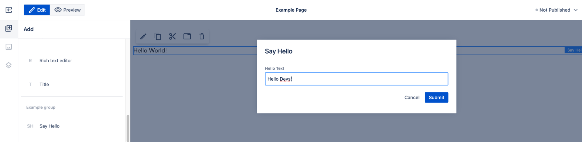
The property value is set on the content node of this Say Hello component instance at the helloText property (according to the name property value at the text field node in the dialog definition):

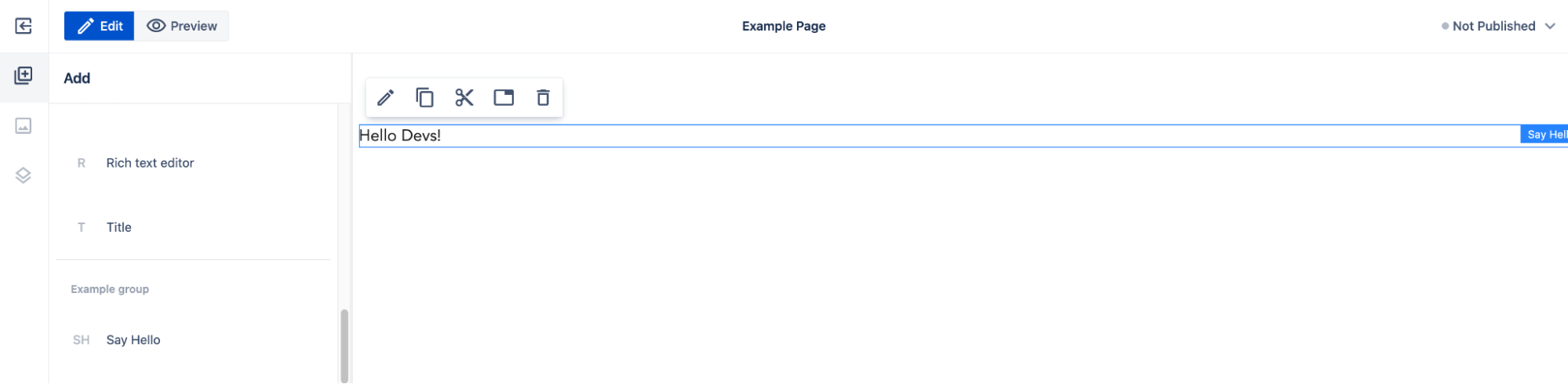
And now the component renderer script will display the property value instead of fallback text:
Let's explore all the options and details of the component definition.
Component definition properties
The component definition is a Sling Resource with resource type ws:Component.
Use the following resource properties to define the component:
| Component property | Required | Value | Description |
|---|---|---|---|
| sling:resourceType | Yes | ws:Component | Defines that this resource is a component definition. |
| sling:resourceSuperType | No | super resource type | Set this property to make your component extend another component. That way, the extended component elements can be reused in the extending components. Example value: wcm/core/components/page |
| title | Yes | string | Component name visible in UI. Example value: Title |
| group | Yes | string | Component group name. Allows us to present related components in the UI. Used while defining allowedComponents. Use the value .hidden to make the component definition not visible in the UI. Example value: General |
| isContainer | No | boolean, false by default | Defines the component as a container. Containers are components that contain child components that can be added, removed and reordered using the authoring interface. If true, the allowedComponents property is required too. |
| allowedComponents | No* | array of strings. Values are absolute component paths and group names. No default value; by default nothing is allowed. |
Array listing allowed child component absolute paths or groups that can be added to the container.
*Required if isContainer=”true”.
Example value: [ "/apps/my-app/components/component1", "/apps/my-app/components/component2", "Content", "Blog" ]
|
| isLayout | No | boolean, false by default | Defines the component as a layout component.
Layout components are displayed in a separate section in the WebSight CMS pages editor from components that are not layout components. It’s up to the component developer to set isLayout=true, but the guideline is to use it for components that: - are used to define page layout - must contain other components to be usable - contain no logic (other than logic related to layout calculation) - interact only on page resize (no other “user actions” allowed) - have no visible UI elements (like texts) Examples of Layouts: - 2-column container - 1-column container - Section with title, image, text and CTA (container including components) Example of components that are not Layouts: - image, title or CTA, all of which have visible UI elements (like texts) - logo cloud, which contain very specific CSS logic and should not be used to create generic page layouts) - Accordion, which contains logic not related to layout calculation - Image gallery, which contains logic not related to layout calculation |
| instanceResourceType | No | resource type that will be set on created component instance | If this property is not set, the resource type of every created component instance node will be set to a value resolved from the component definition resource path. If set, then this property value will be used instead. This allows multiple components definitions, which will result with the same resource type used for created component instances. It could be used to deliver components (or layout components) with different initial content. For example: The Section layout component contains an embedded Title component and is a container that renders child components below the Title. If the authoring section with four columns needs to be created, then the Section component needs to be added with four containers inside that are configured to be displayed as columns. If this page layout is commonly used during content authoring then a new layout component could be implemented to simplify the process. A Section with four columns layout component could be added. The instanceResourceType property should be set to the Section component resource type and initial content should provide the same structure as was created manually before (a section plus four configured child containers). This way, after dropping Section with four columns on the page, the commonly used content structure will be ready to use immediately.Example value: my-app/components/section
|
Dialog
Dialog is the form with inputs that allows you to set data on component instances in content.
The form layout, fields and behavior are described by resources starting at a resource named dialog defined under the component definition resource. If the dialog resource is not defined, then the edit component properties action is not available in the editor.
This is what the dialog definition structure looks like with the same dialog displayed in the editor:
 Component dialog resources structure in Resource Browser tool.
Component dialog displayed after edit component action in pages editor.
Dialog for editing component properties is opened in edit:dialog context - the context
can be used to disable some fields depending on the dialog usage. Read more about context and other
aspects of the dialogs in the Dialogs documentation.
Rendering script
To render components, the rendering script file resource is needed. The file resource name should be the same as the component name with the .html extension (the recommended and supported scripting language in the WebSight CMS is the HTML Templating Language, or HTL). See the HTL specification here
If Java support is needed in the HTL, the recommended solution is to use the Sling Models and the HTL Use-API. See details:
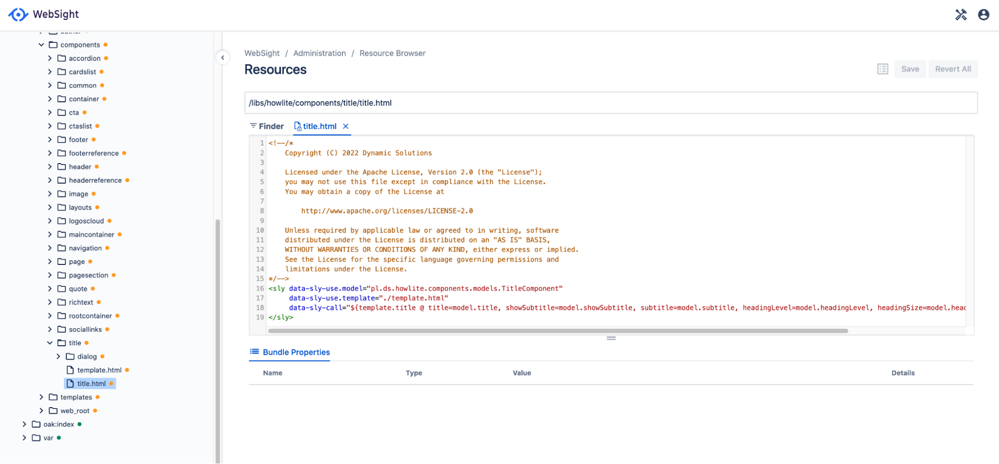 Component renderer script in the WebSight Resource Browser.
Template
Component template is a resource that gets copied when creating a new component instance and adding it to a page. In other words, it is the initial content of the component. It is used to set default values or prepare necessary content structure. It could also be used to save work during content authoring.
The component template resource is a component definition sub-node with the name template.
The template resource is optional. If it's not present, a new empty node will be created.
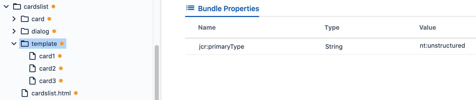 Component template resources structure (view from the WebSight Resource Browser tool).
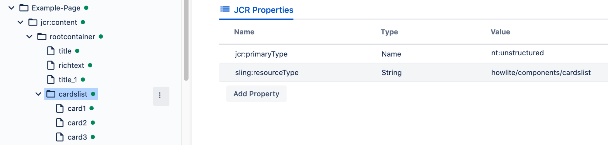 Component instance added to the page content initialized from template
(view from the WebSight Resource Browser tool).
Edit configuration
A component may provide an optional resource named editConfig providing configuration customizing component behavior in the Page editor.
Reload on update
Edit config property named reloadOnUpdate defines what should be refreshed on the component update, for example after editing. Options:
self- default behaviour - only updated component is refreshedparent- parent component is refreshedpage- edited page is refreshedbrowser- reload of the Editor in the browser
Hide actions
Edit config property named hideActions can provide an array of Page editor actions names
(see list of the component actions with names in the Page editor)
that should not be available for the component.
Default action
Edit config property named defaultAction can provide a name of a Page editor action
(see list of the component actions with names in the Page editor)
that should be executed if the author double-clicks on the component.
If not provided, the inline-editing action (see Inline editing) is executed
if the component is configured to support it, otherwise the edit-properties action is executed
if the component has a dialog configuration (see Dialogs).