
Máté Széll
Sep 26 2023 3 min read
Máté Széll
Sep 26 2023 3 min read

It’s always exciting to tick another item off of our roadmap. This time it’s especially fascinating, since we’re delivering something that’ll affect almost all of our authors during their daily content producing activities. A couple of releases ago - just like in other CMSs - the only way to edit component properties was via the modal dialog.
Since this solution has quite a long feedback loop we started experimenting with other solutions that could support quick changes to the page with close to instant feedback. The first of such improvements was the side-panel. It was introduced a couple of releases ago and the update of a field is saved and reflected on the page content automatically. This one enables authors to quickly prototype and check various styles, layouts, shapes, sizes, etc. without opening the modal dialog multiple times. It feels quite natural for lots of field types like dropdowns, checkboxes or radio buttons. For text fields though, it’s still not the perfect one.
For simple text fields and rich text editors it’d feel more natural to edit them right inside the workspace, where those values are used by the rendered components, so we did just that… and we call it inline editing.
At its core, inline editing is implemented using our extensions framework described here. This core extension is responsible for collecting available editor types implemented as WebFragments and supplying the editor with the inline editing action in case it’s configured for the component.
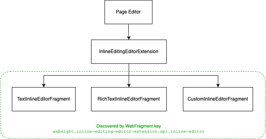
The feature can simply be enabled by providing a minimal configuration via the component definition (see our docs). This includes the name of the property to be edited, a list of selectors which can be used to identify the DOM nodes to be used for inline editing and last but not the least name type of editor. With this configuration the inline editing action should appear in the component’s toolbar which triggers inline editing. By clicking this button, the DOM nodes which can be selected by the provided selectors turn editable. The changes can be saved in various ways, by clicking the checkmark button on the inline editing toolbar or by simply clicking outside the edited area. The cancellation works similarly, it can be triggered by the Escape key on the keyboard or clicking the cross button on the toolbar.
To achieve the best possible UX, we handle saving optimistically. It means that the user sees the updated value in place on the page right after triggering saving even during the period of saving being in progress. As most of the cases the saving succeeds it provides a lot better authoring experience than showing a loading indicator temporarily.
There are two inline editor type provided out-of-the-box: simple text editor and rich text editor. Let’s check them in detail.
Our goal was to experiment with multiple solutions. The first (and simplest) of this kind was making a simple text field editable right inside the content of the page. To use this method of inline editing you should set the type to text in the configuration.
Simple text editing utilizes contenteditable attributes of the DOM nodes and makes them editable easily. This makes it performant and supported cross-browser. It also makes the UX seamless since the DOM nodes actually stay the same, but editable.
UX-wise, since these values are single lines of text, we decided to use the Enter key as a shortcut to save the changes, just like Escape works in general for cancellation.

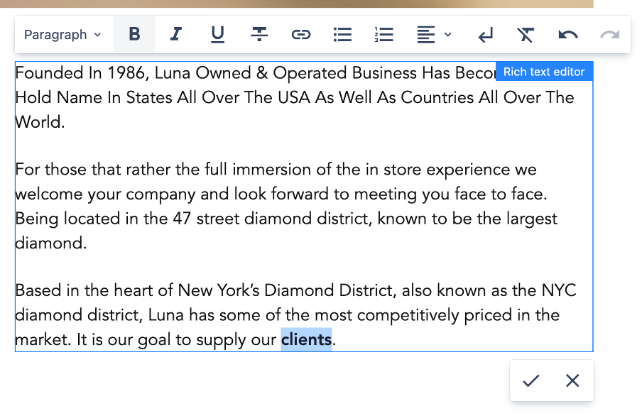
As we’ve seen that inline editing simple text fields are a big boost in terms of UX, we wanted to make it even better and started working on enabling rich text fields to be editable as well. The problem is that these fields - as the name suggests - are not simple texts. They’re actually complex html or markdown templates that are rendered by the component one way or another.
As such the editing is more complicated than in case of simple text fields. For regular rich text fields, we use Tiptap editor, so it seemed logical to use it here as well.
Tiptap creates its own root node, we had to make sure whenever the user enters edit mode, that root node contains the proper content. So basically the page’s selected DOM nodes are replaced by Tiptap’s root node with their internal content. It’s also important to keep the styles from the page when entering edit mode so that the mode change is as seamless as possible, thankfully it’s easy to achieve with Tiptap.
As mentioned above, the main goal for these improvements was to make the editing workflow more natural and we’ve still seen room for improvement in terms of entering edit mode. Clicking on a component and then clicking on the toolbar button is still one more user interaction than necessary, so we made it trigger on double-click.
This felt perfect for inline editing, but it felt useful for other things as well, so if there is no inline editing configuration for the component, double-click opens the properties modal. We’ve also made it configurable to fit everyone's needs even if the primary action for a component is not inline editing or opening the properties modal (see details in our docs).
As you can see we came a long way from editing a component’s fields one-by-one on the properties modal. Obviously it’s never 100% complete, so even though it’s a major milestone in terms of UX for authors, we still have limitations and also ideas for the future how we can improve it even further.
The fact that only a single property can be edited per component is definitely limiting so making it possible to configure multiple editable fragments of the component would be a good candidate for future improvements in this area.
Also it might make sense to allow editing field types other than text or rich text as currently these are the two built-in inline editor types. This can be extended by third-party developers, so in the meantime, anyone can implement their own editor according to their custom needs.
__
Mate Szell has worked as WebSight's Front End Engineer until December 2023.